Your Studio KOHLER Workspace
Your Studio KOHLER Workspace
W Brisbane
Australia’s History Meets Ultra-Modernism
- LOCATION: Brisbane, Queensland, Australia
- DEVELOPER: Shayher Group
- ARCHITECT: DBI Design
- DESIGNER: Nic Graham & Assoc.
Deep in the South Pacific, you’ll find the city of Brisbane, a coastal destination on Australia’s eastern seaboard where the Brisbane River meets Moreton Bay and the Coral Sea. Brisbane is the gateway to Queensland tourism, well known for its access to excellent beaches and resort areas.
Sydney-based designer Nic Graham—one of Australia’s most sought-after hotel designers— used the city’s water-based landscape as the inspiration for work on W Brisbane, which opened in mid 2018 as the first new-construction five-star hotel to arrive in the city in two decades.
Graham and his team blended the modern metropolitan design DNA of the W hotel brand with abstract visual references to water and Brisbane and the confluence of the two. Their guiding narrative was “A River Dreaming”—a direct reference to the Brisbane River’s sinuous journey through Brisbane, from the hills beyond the city to its coastal waters.
“The celebrated serpentine shapes, movement of water through landscape and floods, are evident in some of the curved design features in the bar and restaurant,” explains Graham. “The river reeds, tidal markers, earthy riverbanks and the ambient life that it supports are all evident in the choice of materials and finishes.” In the hotel’s rooms, guests will find energetic design expressions that offer depth and movement: a blend of flat and lustrous surfaces, high-contrast graphics, matte black accents and fixtures, organic geometries and vibrant upholstered accents.
The guest bathrooms are an experience unto themselves. An open feel contains graphic glass that creates a dappled light effect, warm stone and elegantly simple accessories that make the bathroom a modern extension of the room design.
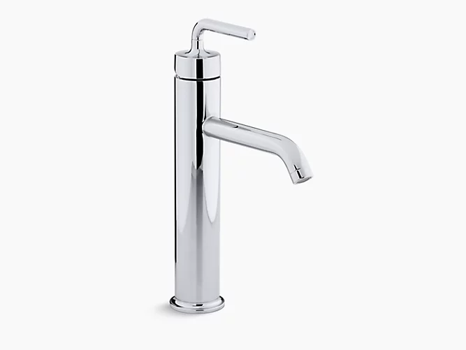
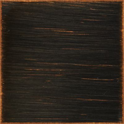
“We used black as an accent in the room on many features to trim and frame,” says Graham. “We often do that, as it is timeless and works well with all schemes.” That aesthetic led Graham to the selection of the KOHLER Purist collection sink and bath faucets, as well as Contemporary Round rainheads and Awaken™ shower products, all in Blackened Bronze (an alternative to the KOHLER Matte Black finish in some markets).
The collection of products combines minimalist architectural forms with sensual design lines, and the Blackened Bronze finish complements the matte black fixtures for an understated, ultramodern appeal.
“The new age of black tapware is modern and bold, without too many tricks or fashion-led styling,” says Graham.
The new age of black tapware is modern and bold, without too many tricks or fashion-led styling.
KOHLER Finishes: Foundation of Craftsmanship
Graham was first introduced to the KOHLER finishing process and the vast product line during an interior design immersion at the company’s Wisconsin, U.S.A., headquarters and was struck by the design and function of the products and the rigor of the manufacturing process.
“It was there that I got to experience the design and manufacturing process of KOHLER tapware and sanitary ware and was indulged in the vast choices the company offers,” he says. “I love the quality and guarantee behind the product. They are the leaders in long-lasting finishes and technology in water saving, comfort control and choice of finish.”
Visit the W BRISBANE website to see more.
Featured Products

Awaken™ G110 Geometric
K-72415-CP
Awaken® G110 Geometric 2.0 gpm multifunction handshower


72" ribbon hose
45981-CP
Color/Finish:

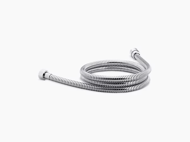
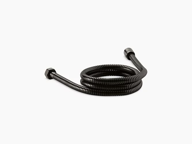

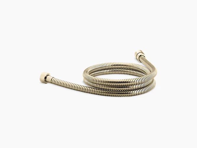

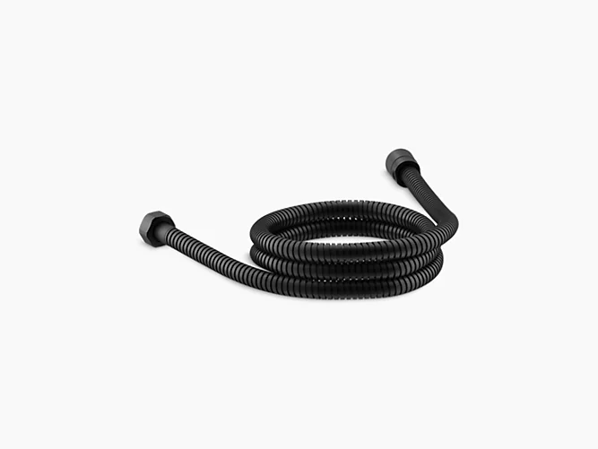
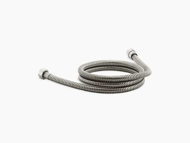
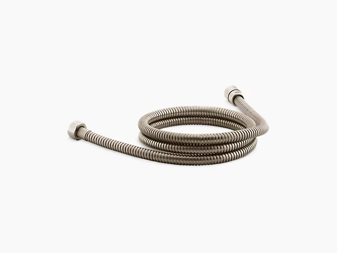
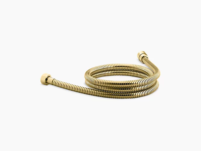
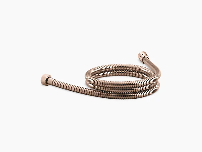
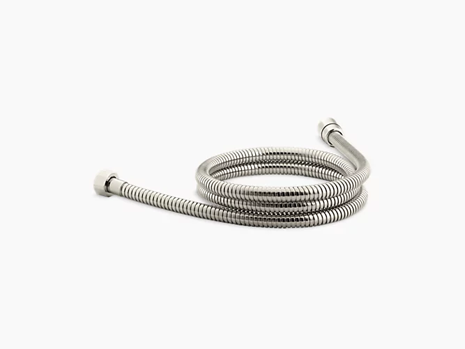

60" metal shower hose
9514-CP
9514-2BZ
9514-2MB
9514-AF
9514-BGD
9514-BL
9514-BN
9514-BV
9514-PB
9514-RGD
9514-SN
9514-TT
Color/Finish:





60" ribbon hose
45982-CP
Color/Finish:


72" metal shower hose
8593-CP
Color/Finish:
